Color

Journal 04
Color looks so odd without a u. I guess in code; American English reigns supreme.
I haven’t settled on the colours for TLB yet – I haven’t even started to think of those finer design points, but I wanted to bring in some colour and start building a system in my code that allows me to easily change and adapt when I do settle on the right colour scheme.
I thought I’d write a little about HSB, colour in Sass and how I’m setting up this system today.
HSB
I’ve spent years living in two colour modes: RGB and CMYK. For so long they were the only way I would work with colour (barring Pantone and Toyo colour systems).
Enter HSB – Hue Saturation Brightness (or HSV for Value if you prefer).
HSB still sits within the RGB colour space, but is reworked to make more sense to the way we perceive colour. (You know, as humans, not computers). It’s a lot easier and more intuitive to use.
This article on Programming Design Systems has some really nice interactive examples to explore RGB, HSB and HSL in. (As well as a far better, more technical explanation than I will give for the moment – see also the great explanation of the different RGB profiles).
The ability to independently target and adjust the Hue, Saturation or Brightness to adapt a colour is a game changer!
I find myself jumping into it more and more. We explore it in my Photoshop classes, in InDesign… it’s just incredibly helpful to help stay within the harmony of your colour scheme. Especially great for buttons and other interactive elements which require a slight, subtle change to indicate interactivity.
HSL
For web, though, we need a slight adjustment across and into HSL – Hue Saturation Lightness. It’s still pretty similar, deals with saturation differently and lightness incorporates both white (100%) and black (0%). This works quite nicely in SCSS.
Variables
Firstly let’s take a look at variables in Sass.
One of the reasons it’s a step above CSS is it’s ability to include variables, do a heap of colour maths and a bunch of other clever things. These are then converted into CSS when we save the file as .SCSS with the help of Rails.
Sidenote: CSS now has variables (though not universal support (though, does anyone use IE these days anyway?)). Check it out on MDN.
It’s really easy to set up these variables in Sass though.
I created a new file called variables.scss sitting within my stylesheet folder. This is going to be the ‘main’ (or ‘master’) of sorts and will be imported into each other .scss file.
@import "variables";Sidenote: I kinda like that we’re moving away from ‘master’ as a term… though admit I’m still so used to it while InDesign maintains master pages…
I’ve added //colors and //color tokens sections in the file and will later add type sizes here too.
Colors gives a name to my chosen hex codes. Later, if I decide to change something, I’ll only need to change the hex code here to create a broad, sweeping change. This is where you would add in your brand’s colour scheme – however they are known.
//colors
$ochre: #dc7d54;
$slate: #323232;
I’ve then added these in to my color tokens.
//color tokens
$primary-color: $ochre;
$secondary-color: $slate;

$title-color: $secondary-color;
$link-color: $secondary-color;
$link-color-hover: $primary-color;
You’ll notice the names here relate much more to where the colours will actually appear. I can also come back and easily change just one element here. ie. change the title-color from slate to ochre.
$ in this case indicates or creates a variable.
For the moment I’m just using the colors I have on my personal website, but these will change (and be easy to update) once I’ve settled on the right colour scheme.
Now, instead of hardcoding colour values in; I can bring my color tokens into my other .scss files like this):
.article-preview__title {
	color: $title-color;
	margin-bottom: 0;
	transition: all .7s;

	&:hover {
		color: lighten($primary-color, 10%);

		transition: none;
	}

}
Color Maths
You’ll see above I’ve also played with the lightness value (back to that HSL) with the hover. Exploring the ‘snap’ immediately in and gently fade out of the hover interaction.
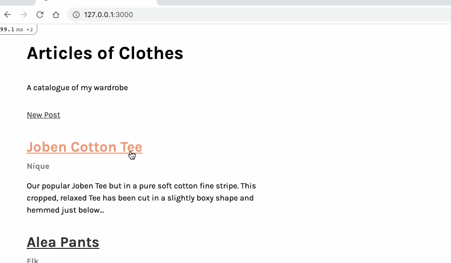
Anyway, these changes bring it to this point:
The thing with adding ‘lightness’ in, is if you go too far the colour becomes white!
Keen eyes might have noticed I’ve been exploring type a little too – I just haven’t had a chance to write it up yet. It’s coming next. 🙂