Typography
Journal 05
Finally some type! Once more, this is really just going to be placeholder until I figure out the style… but I just wanted to work with something a little more my style than good ol’ default Times.
Enter my current favourite from Google Fonts: Karla by Jonny Pinhorn. A beautifully quirky grotesque sans serif.
Setting a default style
Ok, so I ended up putting this straight on the html; so it really does become the default everywhere. (Instead of adding it to the <p> or <body> elements.
html {
    font-family: 'Karla', sans-serif;
    font-size: 16px;
    line-height: 1.5;
}
This then sets the baseline for type across the app and Karla will apply everywhere, unless I target it with specific elements. Same goes for a line height of 1.5 (I feel this is about right – I might loosen it slightly later.)
Type is always just so much bigger and looser on web than in print. And I’ve spent so many years honing for print…!
I do like the flexibility of type here though. No need to spend hours perfectly manipulating the text into beautiful ragged edges, or justified blocks. Responsiveness immediately makes this a complete waste of time!
It has been a good lesson in learning to let go with some of those imperfect type moments – widows, orphans and the like.
Anyway; this is how it changes when we bring in Karla and the line-height.
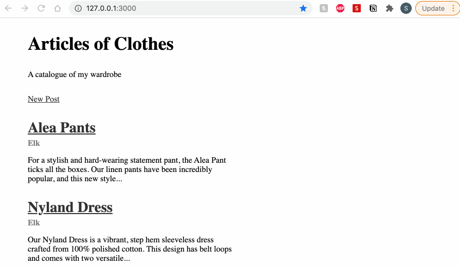
Much better!
Type Scales and rem
Ok; now to figure out a good type scale. I feel this might still be tweaked a bit later on… Let’s set it up as variables again. This means I won’t have to hard code it in everywhere, either.
It goes on like this:
$type-scale-6: 3rem;
$type-scale-5: 2.25rem;
$type-scale-4: 1.5rem;
$type-scale-3: 1.25rem;
$type-scale-2: 1rem;
$type-scale-1: .875rem;
rem: Root Em. A really great unit that relates to the root dimension. In this case, it’s that font-size: 16px; that I set earlier on the html element. This creates a really nice relation between my type scale and that key type size. If I later decide to change it; everything will readjust to suit it.
See how changing the html font-size value changes all of the values at once:

That’s why getting these proportions right is really useful (and why I might tweak them a bit later so they’re closer to what I’m after (need a step between 1.5 and 2.25 rem).
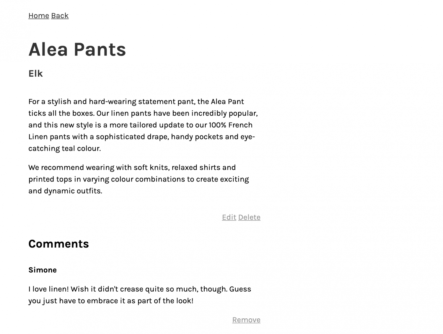
I can now really easily refer to my type scale variables.
.article__title {
	font-size: $type-scale-6;
	color: $title-color;
	margin-bottom: 0;
	font-weight: 600;
}
And that, at least, is a small start!
Now it really is starting to need some imagery!