A typeface currently called Pieta*
One of the most spectacular moments of my recent trip to Venice was singing in the Ospedale della Pietà – a convent, orphanage and music school famously home to Antonio Vivaldi of The Four Seasons fame. (The originally famous Four Seasons; not the landscaping business of recent Trump fame).
The history of the Ospedale is incredibly fascinating. To hear the touching stories of the orphaned girls and tour the beautiful building and stunning musical collection was incredible. Remarkably for the era; Venice was incredibly progressive when it came to looking after their people and the girls all had very fortunate lives. They were educated, given a dowry and many trained as musicians and the Ospedale reached great fame. There are mentions of travellers coming especially from all around Europe to hear them sing or play. A number of girls became celebrities in their own right, even marrying into aristocracy.
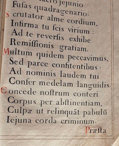
While there, I stumbled upon this beautiful 18th century hymn book and was immediately drawn to the stencil-like characteristics of the type. The two pages on display are missing a number of modern letters (h, k, w, y, z), but have a look at that ſ (long s) and the range of ligatures! I really like the quirky, yet modern feel of the type – incredible, considering how old it is!
Back at uni, type design was one of my favourite classes, though it has been years since I’ve had the time to even consider it. (It is a long, careful and painstaking process requiring great dedication!)
When lockdown hit, starting Pieta* became the perfect project. My partner, Dennis – who’d created his own typeface Dihot – agreed to jump on board and so we set off together; drawing bezier curves and trying to decipher the type ‘clues’ or ‘dna’ given to us in the hymn book.
It’s still a work in progress. And requires many more hours of refinement – not to mention even a basic look at bringing those side bearings in order! Yet, I’m pleased with how it’s coming along so far…
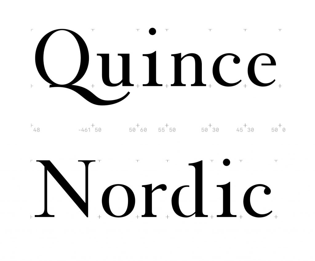
Now it’s a matter of figuring out which quirks of the typeface to keep! That e, for example, feels a little unusual… The challenge ahead will be to create harmony without losing its character.
*Any ideas for a great name?