White Space

Journal 02
I wondered how long it would take before I couldn’t refrain from some styling anymore…! Even just a little white space! Not long at all, it seems.
I added in a few extra entries using terminal to have some content to work with and test on. (That form to enter content is sure high on my list…!)
What follows is pretty standard CSS, but the files I’m using on rails are in SASS (SCSS) files – which add a whole new realm of functionality, such as variables and colour maths… This is going to be fantastic for building up my component library / design system.
Spacing
Taking a look at a single ID, it comes up like this (and desperately needs some styling!)

The text sits right on the very edge, which is really uncomfortable. My students know my love of margins – they just make everything better and feel in place. At least the body text is responsive!?
I created a div to wrap all ‘main content’ in. This brings the content in from the very edges of the window. The idea is to wrap practically all content in this – which will keep it nice and consistent throughout.
.main-content {
    margin: 0 60px;
}
This immediately makes a pretty big difference:

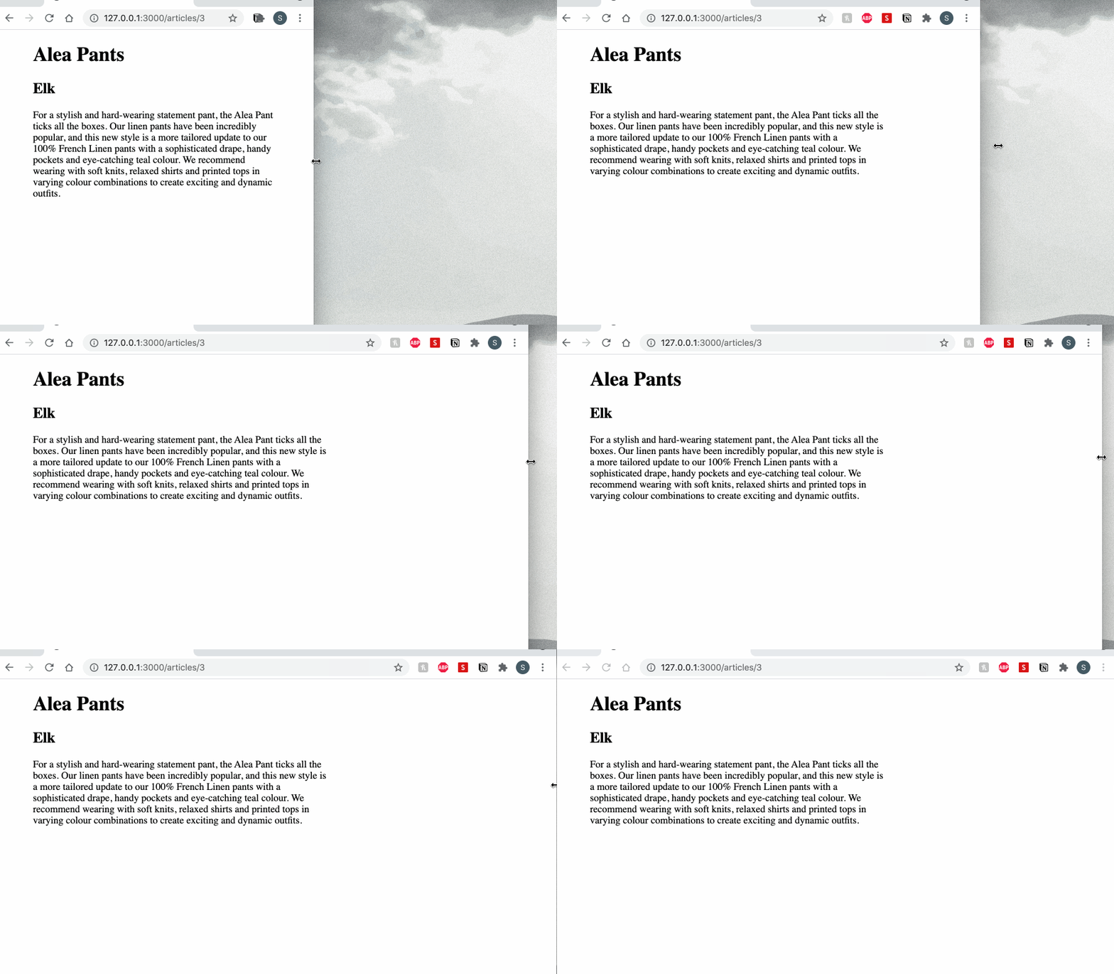
And then it starts to become really exciting (for a type nerd like me). We can use characters to determine the max-width! (It’s really nice to get the perfect line length for reading!)

See how the text stops extending once it reaches the character limit? This is a little longer (60ch) to exaggerate/demonstrate the change; but I’ve set it to 50ch which feels just about perfect as a nice little snippet to read.
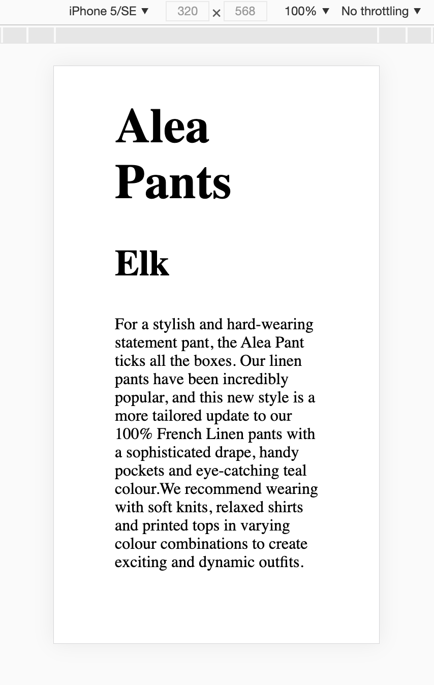
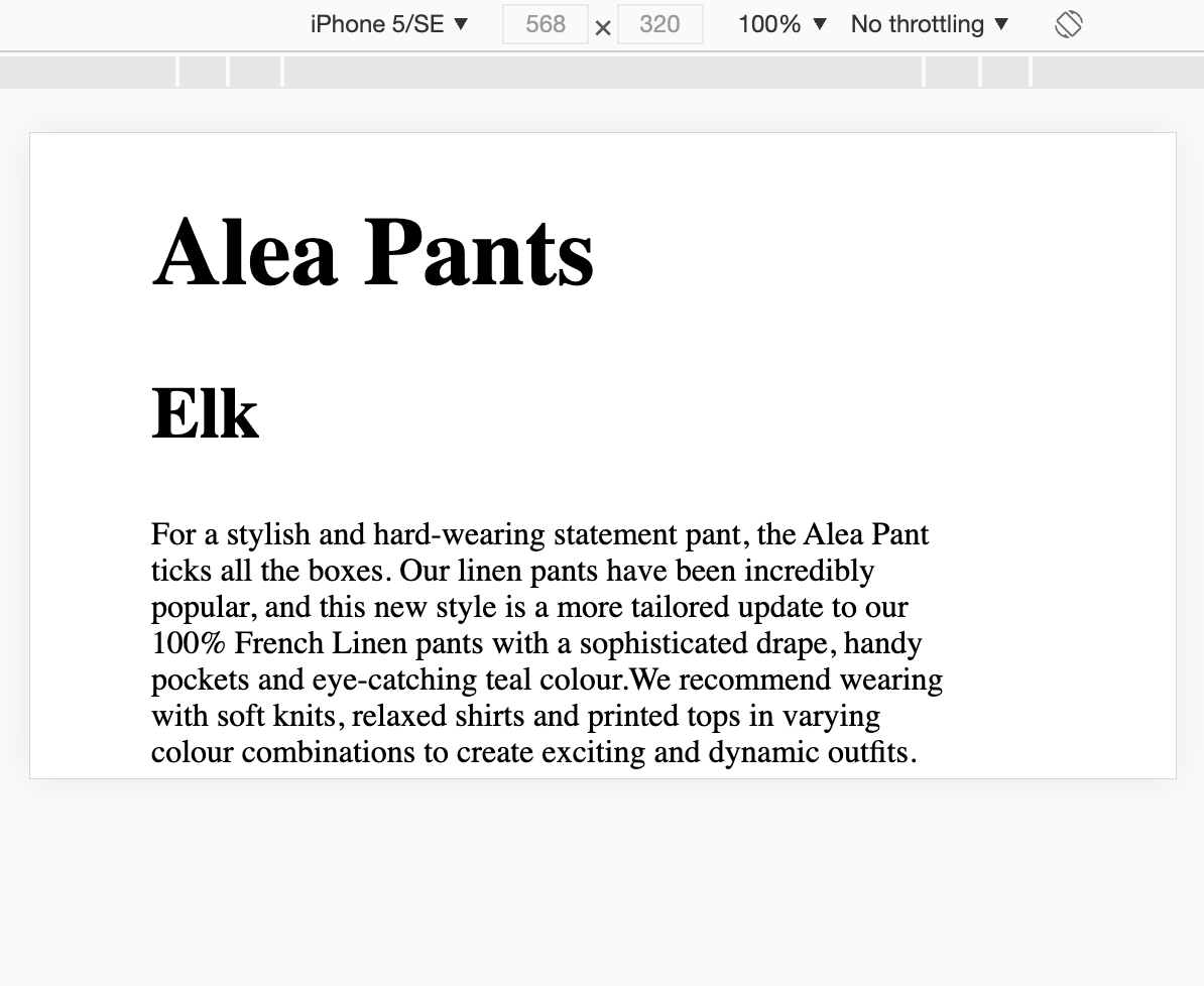
It works pretty perfectly on mobile too.


Of course it’ll need some special mobile treatment – especially with the type – but I have plans for that!
I also prefer working to small mobile sizes – as it’s always the one with the most constraint (and a little extra space never hurt anyone).
It’s already a much more comfortable reading experience – mobile and desktop! I wish it were implemented on this blog… might have to dive into the .css here soon.
Back into Rails next. It’s CRUD time… (I have my mind set on creating that form).
