Category / Process
-
![pieta venetian typeface 18th century]()
A typeface currently called Pieta*
One of the most spectacular moments of my recent trip to Venice was singing in the Ospedale della Pietà – a convent, orphanage and music school famously home to Antonio Vivaldi of…
-
![]()
Improving the Spotify Podcast Experience
Why doesn’t anyone I know listen to podcasts on Spotify? Starting with this question about Spotify podcast use, my user interviews and research led me in unexpected directions on a journey to…
-
![Project 365 poster Lotus and Parsley]()
Project 365 – Home Collections
Inspired by the one place I would love to be, but can’t, due to lockdown… Each poster is composed of black and white photos I’ve taken of flowers, seeds and seed pods…
-
![]()
Botanical Printing Workshop
A beautiful day spent exploring eco printing techniques with my mum and aunty. Carla Rose from Elemental Leaf ran a wonderful workshop where we learnt to use Eucalyptus leaves to dye natural…
-
![]()
Winter at MADA
I worked for MADA (Monash Art, Design and Architecture) over the mid-year break designing for our Open Day, Faculty Gallery and end of year show ‘MADA Now’. Here’s a snapshot of what…
-
Honours: visual communication and politics
I’ve been looking into how visual communication can be employed to create/increase political engagement. How can it be used to breathe life into something that appears to be so boring?! While there…
-
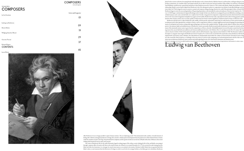
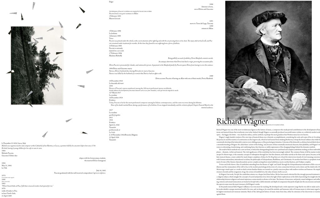
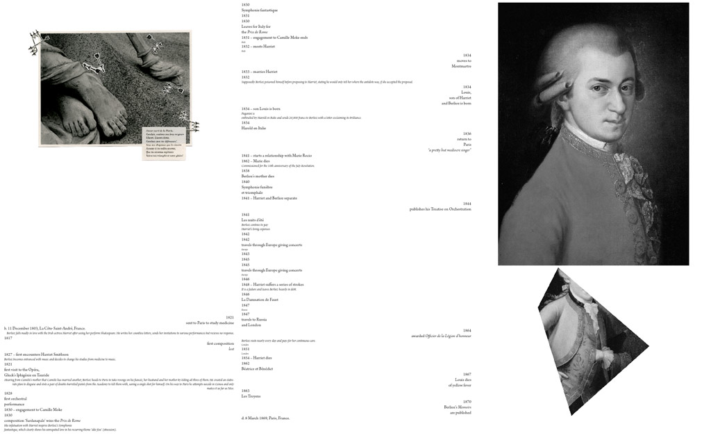
Visual Interest in a fluid layout
Playing around with turning my Composers publication into an Epub, these were a few of the unformatted conversions. I find them to be quite interesting and beautiful in their own right. The…
-
![]()
Victorian Architecture Awards
Working on the Victorian Architecture Awards Identity and Catalogue for the 2013 exhibition of entries. The identity is going to consists of 10 patterns, one for each category and all inspired by…
-
While creating Hamer Hall…
A couple of compositions I came up with while creating my Hamer Hall poster. This composition looks at a more systematic representation of music, taking the shapes of the building to create…
-
A Play on Advertising…
A critical look at the wording used in advertising. The greyscale images are the original adverts, the coloured versions my take on the psychological techniques used or the contribution made by unsuspecting…